Menu Design Ideas: Smart Layout Tips That Can Influence Orders
Increasing your restaurant profit margins often starts with the very first thing a customer sees: your menu. According to research, a well-structured menu can increase a restaurant's profit by 10% to 15% without changing a single ingredient or price. Many business owners view their menu as a simple list of items, but it is actually your most powerful silent salesperson
Using strategic menu design ideas can influence what a customer decides to order before they even speak to a staff member. By understanding the psychology of how people read and process information, you can guide them toward your most profitable dishes.
Now, let’s dive into the science of layout and how you can transform your menu into a profit machine.
Your Menu is Your Silent Salesperson
The concept of menu engineering is the study of how the design and layout of a menu can influence customer spending. It is a data-driven approach that combines psychology, graphic design, and financial analysis.
When a guest opens your menu, they are often looking for guidance on what to choose. If the design is cluttered or confusing, they might default to the cheapest option or something they have ordered before.
A well-designed menu acts as a roadmap that highlights your best work. It uses visual cues to draw attention to specific items that you want to sell more of. These items are usually your "Stars," which are dishes that are both highly popular and offer a high profit margin. By making these items the focal point of your design, you can significantly increase your overall revenue.
Strategic menu design is not just for high-end dining rooms. It is equally important for takeaways, cafes, and fast-casual environments.
Whether your menu is a physical card, a digital board, or a mobile ordering app, the principles remain the same. Clear layout and thoughtful positioning help reduce decision fatigue and improve the overall dining experience for your guests.
The Golden Triangle: Where Your Customers Look First
When customers look at a menu, their eyes tend to follow a very specific path known as the Golden Triangle. Studies in eye-tracking technology have shown that people usually look at the middle of the page first.
From there, their eyes move to the top right corner and finally to the top left. This triangular movement happens in a matter of seconds, making these three areas the most valuable real estate on your menu.
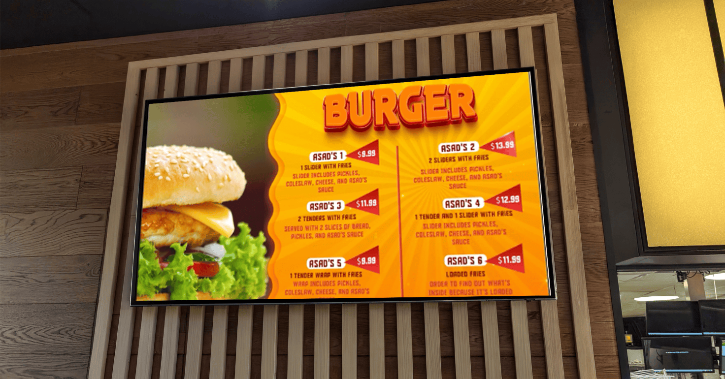
Because the top right corner is such a high-value zone, this is the perfect place to put your most profitable "Star" dishes. You might place a high-margin seafood dish or a signature steak in this area to ensure it is one of the first things a customer considers. Placing a dish here gives it a natural advantage over items located at the bottom or on the back of the menu.
This eye-tracking logic also translates to digital ordering screens and smartphone apps. While the screen size is smaller, the top of the list still receives the most attention.
When designing for mobile apps, ensure that your most popular and profitable items are visible without the customer needing to scroll down. Using this layout logic ensures that your high-margin items are always front and centre.
The Decoy Effect: Using Price Anchoring to Influence Choice
Price anchoring is a psychological technique where the first price a customer sees sets the expectation for everything else they look at.
On a menu, this is often called the Decoy Effect. By placing a premium, high-priced item at the top of a category, you make the items listed below it seem like a much better bargain. The high-priced item acts as a "decoy" that makes mid-priced items feel more reasonable.
For example, if you list a premium seafood platter for £45 at the top of your mains section, a £22 salmon dish suddenly feels like a great deal. The customer might not have been willing to spend £22 otherwise, but compared to the £45 anchor, it seems affordable. You do not necessarily expect to sell many of the decoy items, but their presence drives sales toward your mid-priced, high-margin dishes.
You can also use a "Chef’s Special" or a limited-time offer as a decoy. By highlighting the quality and exclusivity of a high-priced special, you set a high bar for value. This encourages customers to choose items that offer the best balance of quality and price. This strategy helps you manage customer perceptions of your brand and your pricing structure.
The Rule of 7: Beating Decision Fatigue
The psychology of choice suggests that having too many options can actually lead to lower sales and increased customer stress. This is known as decision fatigue or the paradox of choice. When a customer is faced with a list of forty different pizzas, they often feel overwhelmed. This leads to them choosing a basic, low-margin item simply because it is the safest and easiest choice.
To combat this, many successful restaurants follow the Rule of 7. This rule suggests that each category on your menu, such as starters, mains, or desserts, should ideally have no more than seven items. By limiting the number of choices, you make it easier for the customer to process the information and make a confident decision. This leads to higher customer satisfaction and less "order regret."
If you have a very large menu, categorisation is the key to maintaining a clear layout. Instead of one giant list of main courses, break them down into smaller sub-sections like Burgers, Pasta, and Grills. This allows the customer to navigate your menu card quickly without feeling lost. A clean design with well-defined categories makes your business feel more professional and organised.
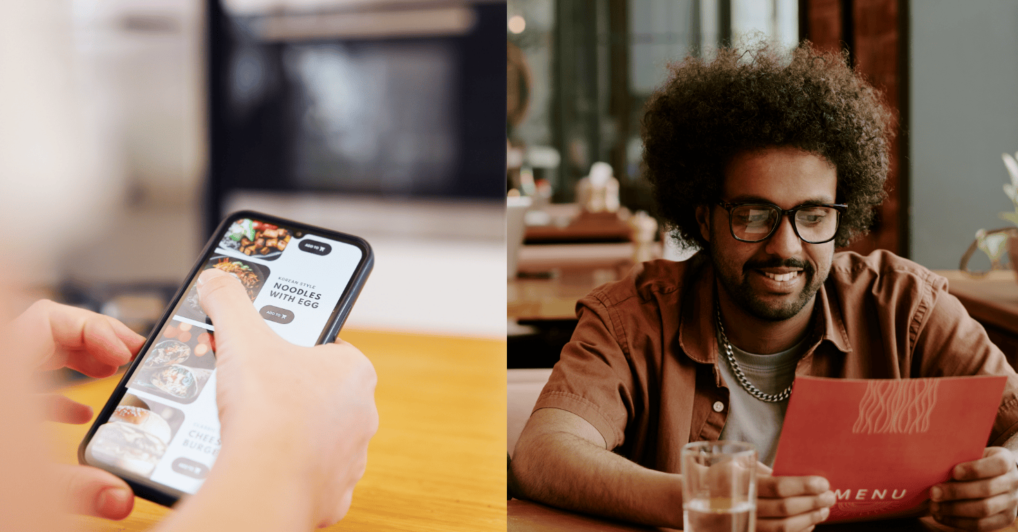
The Scroll-Stop Layout: Designing for Delivery Apps
In the modern UK food scene, many customers will interact with your business through a smartphone screen. Designing for delivery apps like Foodhub requires a different approach than designing a traditional paper menu.
On a mobile app, the customer is scrolling vertically, which means your visual hierarchy must be adjusted for a narrow screen. This is where you need to implement a "scroll-stop" layout.
The hero image strategy is critical for digital success. On a smartphone app, your most profitable item needs a professional, high-quality photo to act as a visual anchor. A beautiful photo of a delicious dish will make a customer stop scrolling and look at the details. Because people process images much faster than text, a great photo can be the difference between a sale and a skip.
The first three items on your digital menu are the most critical for conversion. These items should represent your brand and offer your best profit margins. Since most customers decide what they want within the first few seconds of opening an app, you cannot afford to hide your best work at the bottom of the list. Optimising your digital menu layout ensures you capture the attention of hungry customers immediately.
Currency Formatting: The Pain of Paying
There is a psychological phenomenon known as the "pain of paying," which refers to the negative feelings associated with spending money. In menu design, even small details can trigger or reduce this feeling. Research from institutions like Cornell University has shown that removing the "£" symbol from prices can lead to higher average transaction values. The symbol reminds the customer they are parting with money, whereas just the number feels like a simple value.
Another effective strategy is called nested pricing. Instead of lining all your prices up in a straight column on the right side of the page, place the price at the end of the dish description. When prices are lined up in a column, it encourages the customer to "price shop" by looking for the lowest number. When the price is nested at the end of a sentence, the customer is more likely to read the description first and focus on the quality of the food.
You should also avoid using leader lines, which are the dotted lines that connect the dish name to the price. These lines draw the eye directly to the price, which is exactly what you want to avoid. A well-designed menu should lead with the flavour and the ingredients, not the cost. Keeping your pricing subtle helps keep the focus on the dining experience you are providing.
The Power of Descriptive Language
The way you describe your food can have a massive impact on its perceived value. A simple Chicken Burger might not excite a customer, but a "Hand-Breaded Crispy Chicken Fillet with Zesty Lemon Aioli" sounds much more appealing. Using sensory adjectives like "flame-grilled," "slow-roasted," and "locally sourced" creates a mental picture for the guest. This imagery triggers the customer's imagination and increases their desire for the dish.
In the UK, the "Provenance Hook" is a particularly effective way to justify premium pricing. Mentioning specific regions like "Lincolnshire Sausage," "Scottish Salmon," or "Cornish Cream" builds trust and implies higher quality. Customers are often willing to pay more for items that have a clear story or a connection to a local area. This technique helps differentiate your business from generic chains.
However, it is important to find a balance with your descriptions. Overly long or complex sentences can be difficult to read and may frustrate customers. Aim for a simple design that uses high-impact words to describe the most important ingredients and cooking methods. A clear and enticing description should make the customer's mouth water while keeping the layout easy to skim.
Designing for Add-On Revenue: The Side-Dish Strategy
Side dishes are often some of the most profitable items on a menu because they have a low cost of ingredients and require little preparation time. However, many restaurants hide them at the very end of the menu where they are easily ignored. Strategic placement of "Sides" can turn them into "Eye Magnets" that significantly increase your average order value.
One effective menu design idea is to place side-dish suggestions in call-out boxes directly under the mains. For example, under your list of steaks, you could include a small box that says "Recommended Pairings" with items like triple-cooked chips or peppercorn sauce. This makes it incredibly easy for the customer to say yes to an add-on. It feels like a helpful suggestion rather than a sales pitch.
Strategic bundling is another way to guide customers toward high-margin chips and drinks. Designing meal deals or "bundles" on your menu can help you move inventory and increase profits. By showing the customer they get better value by adding a side and a drink, you increase the total transaction value. This layout strategy ensures that your "Add-Ons" are never an afterthought.
Visual Hierarchy: Using Eye Magnets and White Space
Visual hierarchy is the arrangement of elements in a way that implies importance. You can use boxes, borders, and different font weights to draw the eye to the dishes you want to sell the most. These visual cues act as "Eye Magnets" that break up the text and highlight your "Star" items. A simple box around a high-margin burger can increase its sales by up to 20% simply by making it stand out.
The importance of white space should not be underestimated in menu design. White space is the empty area on the page that surrounds your text and images. A cluttered menu with no white space feels "cheap" and chaotic, which can be stressful for the customer. A clean layout with plenty of white space feels "premium" and professional, allowing the dishes to speak for themselves.
Typography also plays a massive role in how customers navigate your page. Use bold typography for dish names and a smaller, lighter font for descriptions. This creates a clear path for the eye to follow. Be careful not to use too many different fonts, as this can make your menu look messy. Sticking to two or three complementary fonts will ensure a beautiful design that is easy to read.
The Low-Commission Pricing Advantage
If you are using an ordering platform that charges high commission fees, you often have to inflate your menu prices to cover those costs. This can make your food look expensive and drive customers away. However, by using a platform that offers a low-commission model, you can keep your prices competitive while still protecting your profit margins. This is a huge advantage for UK takeaways and restaurants.
You can use your menu design to show customers that they get better value by ordering directly through your site or app. For example, you could highlight that certain portions are larger or that exclusive meal deals are only available through your direct channel. This comparison design encourages brand loyalty and helps you move customers away from expensive third-party aggregators.
By using your own branded website and app, you have total control over the layout. You can update your menu in real time, test different descriptions, and highlight your most profitable items whenever you want. This flexibility allows you to constantly refine your menu ideas to ensure you are always maximising your revenue. This direct-order incentive is a powerful tool for building a sustainable and profitable business.
Allergen Design: Compliance Meets Aesthetics
In the UK, food businesses must comply with strict regulations regarding allergen information, such as Natasha’s Law. This requires you to provide full ingredient lists for pre-packed for direct sale food. While compliance is vital for safety and legal reasons, it can often lead to a cluttered and unattractive menu layout. The challenge is to provide this information without overwhelming the customer.
The icon strategy is a great way to incorporate allergen information while maintaining a clean layout. Using modern icons for Vegan, Gluten-Free, and Nut-Free options allows guests to find what they need at a glance. This removes the need for long blocks of text that can interrupt the flow of your design. Providing a clear key at the bottom of the page ensures everyone understands what the symbols mean.
Inclusive menu design builds trust with UK families and customers with specific dietary needs. When a guest can see clearly that you take their safety seriously, they are much more likely to become a repeat customer. Good design is about making everyone feel welcome and ensuring they can find a dish that fits their lifestyle. Balancing aesthetics with clear information is the hallmark of a well-designed menu.
Menu Engineering: Categorising Your Dishes
To effectively use menu design ideas, you first need to categorise your dishes into four specific groups based on their popularity and profitability. This matrix is the foundation of menu engineering. The first group is "Stars," which are items that are both high in profit and high in popularity. These are the items you should highlight with boxes, photos, and prime positioning in the Golden Triangle.
The second group is "Plough Horses," which are popular but have a low profit margin. These are your staples, like a basic Margherita pizza. You don't need to promote these heavily, but you should look for ways to increase their profitability, perhaps by slightly increasing the price or reducing the cost of ingredients. The third group is "Puzzles," which are high in profit but low in popularity. These items often just need a better description or a more prominent place on the layout to start selling.
The final group is "Dogs," which are low in profit and low in popularity. These items take up valuable space on your menu and may even confuse your guests. The best strategy for "Dogs" is usually to remove them from the menu immediately. By focusing your design on your Stars and Puzzles, you ensure that every inch of your menu is working to increase your bottom line.
The Art and Science of Sales
Menu design is a continuous process of testing, refining, and adjusting. It is part art and part science. By understanding the principles of eye-tracking, price anchoring, and descriptive language, you can create a menu that guides your guests toward a great experience and better profits. A well-structured layout reduces stress for your customers and makes your business more efficient.
The core principles we have discussed, such as the Golden Triangle and the Rule of 7, are timeless strategies used by the most successful restaurants in the world. Whether you are updating a physical menu card or a digital app, these tips will help you stand out in a competitive market. Remember that your menu is a living document that should evolve as your business grows and customer tastes change.
Every element of your design, from the bold typography to the use of white space, should have a purpose. When you treat your menu as a strategic business tool rather than just a list of food, you will see a real impact on your revenue. Implementing these smart menu design ideas is one of the most cost-effective ways to improve your business and build long-term success.
Turn Your Menu Into a Profit Machine with Foodhub for Business
Foodhub for Business provides the smart technology you need to implement these high-converting menu design ideas with ease. Our all-in-one ecosystem allows you to build beautiful, digital menus for your own branded website and mobile app. Because we offer a low-commission model, allowing you to reinvest in your business growth.
Our tools are designed specifically for the UK hospitality industry, helping you streamline your operations and connect with more customers. Whether you need to update a price, add a high-quality photo, or create a new meal deal, our platform makes it simple and fast.
We provide 24/7 human support to ensure your technology always works as hard as you do. To see how our POS and ordering systems can help you implement these smart layout tips, speak with Foodhub for Business today.